Just when we thought Samsung had run out of ideas on how to hold its ground in the competition against Chinese OEMs like Xiaomi in the budget smartphone segment, the company brought out the big guns with the Galaxy M20. Of course, Samsung has simply decided to offer more bang for buck than it has ever done before, the only way it can take the fight back to Chinese manufacturers.
The M20 may still be dwarfed by some competing phones in terms of overall specs, but at a starting price of ₹10,990 ($112), it offers some impressive features that we still can’t believe are actually being offered for such a price. Whether all those features come together to form a cohesive package that we can recommend is what we’ll find out in this review (although the title has probably given away our overall impressions already).
Note: We reviewed the 4GB+64GB variant, which is priced at ₹12,990, but you can expect to have the same experience from the 3GB+32GB model if that’s the one you wish to purchase.
Design: Impressively compact despite 5,000 mAh battery
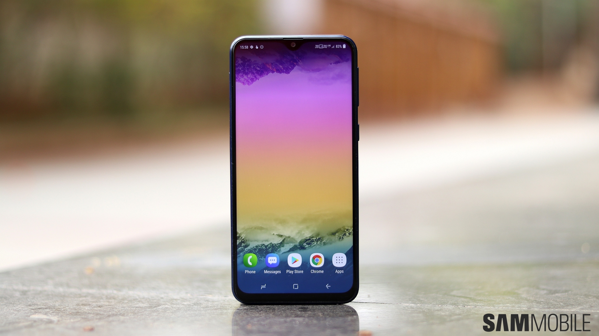
The Galaxy M20 is different from any previous Galaxy phone at first glance simply because its front camera is placed at the center. The notch isn’t noticeable when the phone is lying on a desk with the screen off, and as you’ll see in the display section, it isn’t really much of a problem, either. But it does offer the benefit of reduced bezels above the display, which is the reason why the M20 is shorter than some phones with 6-inch screens despite having a 6.3-inch screen.
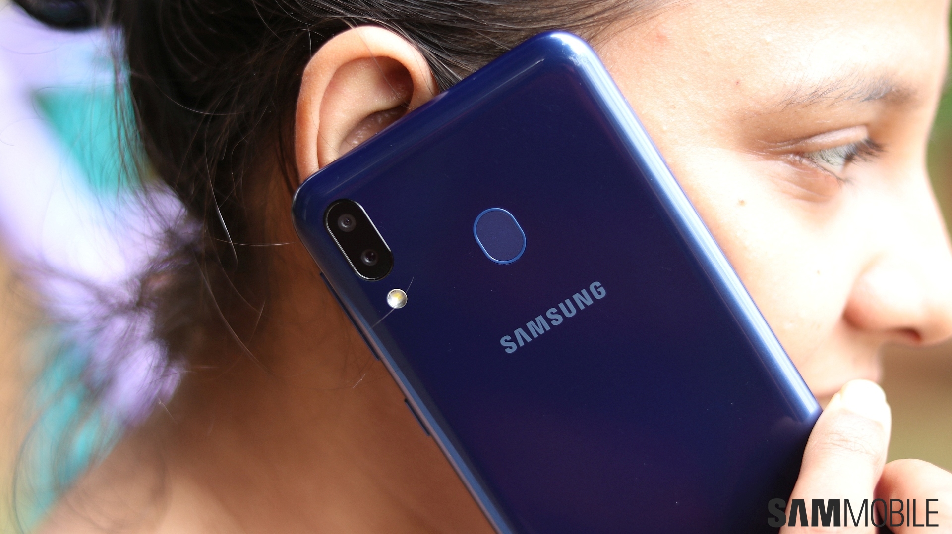
The bottom bezels, like other Samsung phones with Infinity displays, are bigger than the ones on the top. The phone is noticeably thick, but that won’t bother you knowing there’s a 5,000 mAh battery under the hood. And like previous budget Galaxies, this one is made entirely of plastic, so it doesn’t feel too premium. But it doesn’t feel cheap, and putting metal even on the sides of the phone would probably have raised the price tag. It does look like some Chinese phones, though, thanks to the fact that the rear cameras are placed on the left edge and not the center.
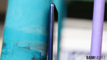
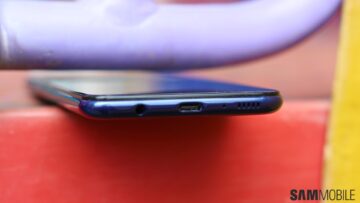
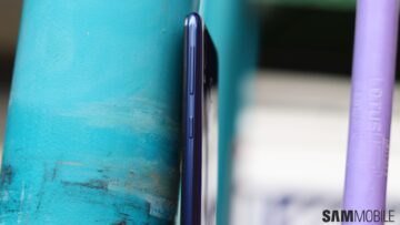
The fingerprint sensor’s location is a tad too high, and I had issues with placing my finger properly on the sensor because it’s both high up and doesn’t protrude much from the body. It’s just frustrating at this point that Samsung continues to have problems with placing the fingerprint sensor on its phones in the ideal location. I know there’s a 5,000 mAh battery inside this thing, but it’s like Samsung is not even trying to make the fingerprint sensor easy to reach at this point. Full marks for accuracy and speed when I do put my finger on the sensor, though.
Display: The notch is surprisingly not that intrusive
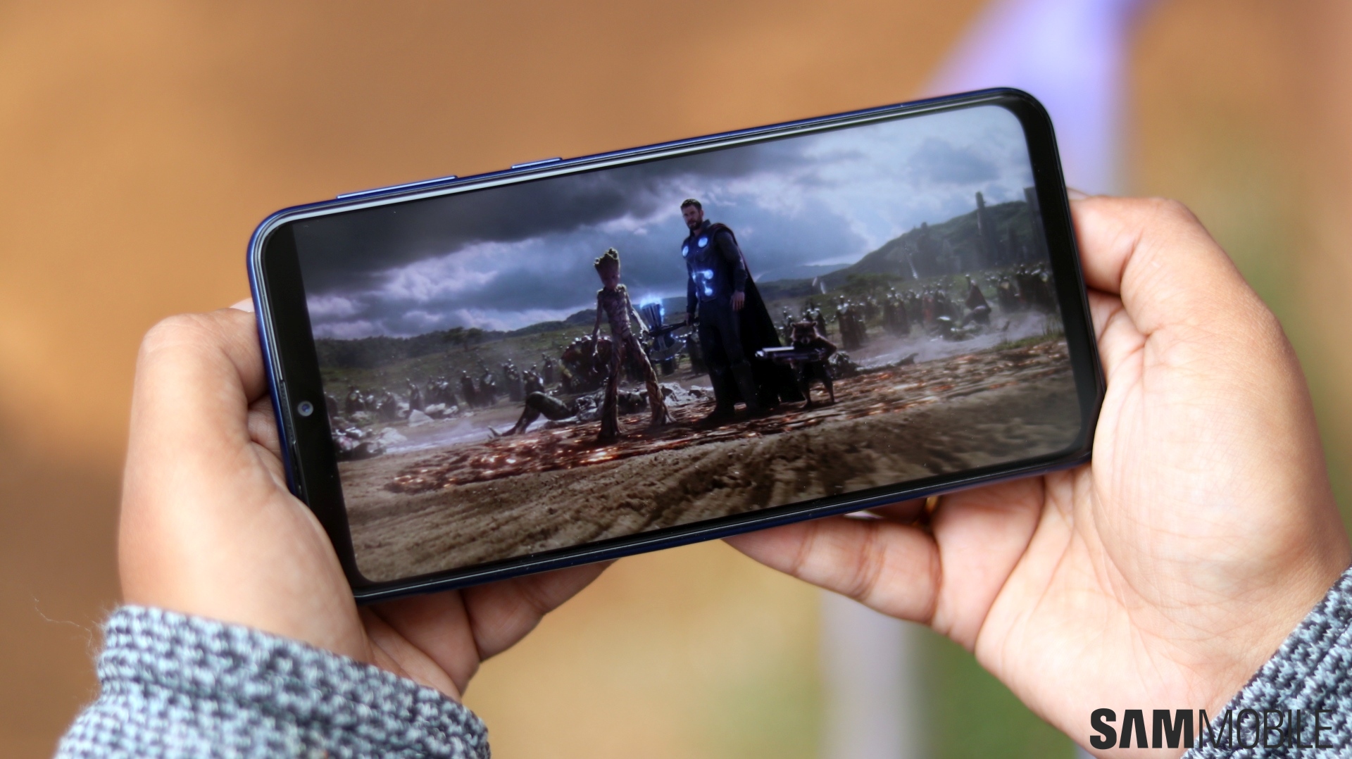
With the M20, Samsung has opted for an LCD display instead of an AMOLED panel, and I have to say it’s a problematic move. Not because that means less vivid colors, although is absolutely the case here since LCDs can’t match AMOLEDs on the contrast front, but because the left and right side of the notch, when blacked out during video playback or gaming, don’t get completely dark like they would on an AMOLED display.
Yes, you read that right. When you watch a video, the phone blacks out the area next to the notch so that there’s no obstruction, and the same goes for games that don’t support the notch. This also makes for a smaller view area in videos and games compared to Galaxy phones with regular Infinity displays, but the bigger issue is that at high brightness levels, that blacked out area doesn’t look completely black. Thankfully, if you’re watching videos indoors, the phone usually keeps the brightness considerably lower than maximum as long as auto brightness is enabled.
Wait, auto brightness? Does a budget Samsung phone finally get an ambient light sensor? Yes, the M20 has one indeed, but for some reason, it doesn’t seem to be very quick. Samsung tells us the phone can take up to a maximum of 5 seconds to automatically adjust brightness, and while it never had me waiting that long, automatic adjustment should have been faster.
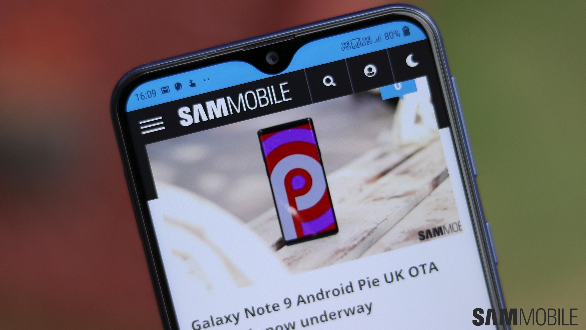
Okay, let’s get back to the notch. I’m happy to say that when you’re not watching videos or gaming, the notch never gets in the way because it usually just comes in between the status bar. And I haven’t had issues with status bar icons, either. There’s plenty of space on the notch’s left and right for showing notification icons and details like time and battery level. The rest of the display remains free for apps to use without having to adapt their UI to accommodate the notch.
As for overall display quality, this is a pretty good LCD panel, with wide viewing angles and high brightness levels. There is some color shift when you are looking at the phone from an angle, though. And I also noticed some dark spots around the notch with white images (like the notification shade) if you aren’t looking at the display head-on, like when the phone was sitting on my desk while I operated it, but none of that is noticeable in regular use.
What is a problem is the poor palm rejection. The M20’s side bezels are slightly smaller than the bezels we see on budget and mid-range Galaxy phones with Infinity displays, and it seems Samsung didn’t think it through and forgot to add any sort of palm rejection, which results in quite a few accidental touches. This was the case with flagships with Edge screens in the initial year or two as well, so I guess Samsung will tackle palm rejection with new devices in the future.
Camera: Affordable access to an ultra-wide camera
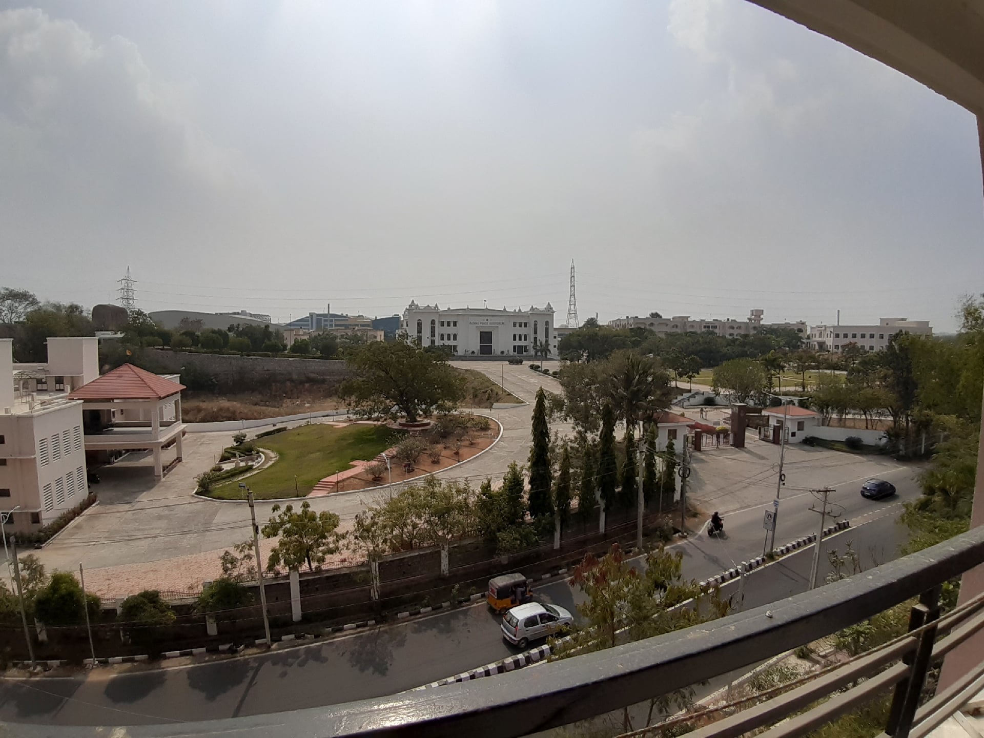
The Galaxy M20’s dual rear camera setup includes a 13-megapixel primary sensor with F1.9 aperture and a 5-megapixel ultra-wide sensor with F2.2 aperture and 120-degree field of view. The ultra-wide camera is of particular interest here, as there’s no other phone even from two segments above the M20’s that can take ultra-wide pictures, other than Samsung’s own Galaxy A series phones. And while the 5MP sensor can’t resolve much detail and needs to have good natural light to take respectable photos, it’s undeniable that being able to take even basic ultra-wide shots can be very handy.
Things fall apart indoors and with poor lighting, as expected. Well lit indoors aren’t that much of an issue, but ultra-wide shots taken outdoors without sufficient lighting have a lot of noise, often rendering the images useless. On the flip side, if there are too many light sources in a scene, things tend to get overblown. And you can’t prevent that, since there’s no autofocus on the ultra-wide camera and therefore no option to manually adjust the exposure.
Check out two scenes taken with the regular and ultra-wide camera side by side below. Note that the fish-eye effect you can see at the edges in the second sample can be removed using the shape correction option in the gallery.



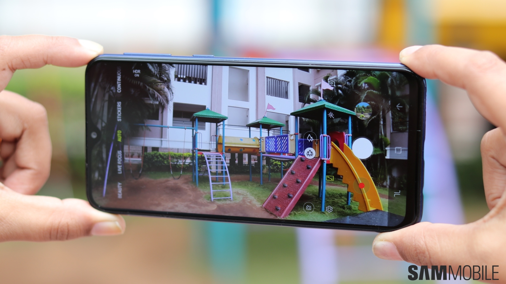
Since the M20 gets an ultra-wide sensor instead of the depth sensor we have seen on dual camera setups on other affordable Galaxy phones, Samsung has built in a software-based Live Focus mode for the rear camera. It only works with faces, though, so if you like taking bokeh pictures of subjects other than a human being, the M20 isn’t the phone you should get. Even Live Focus pictures of people are hit and miss, but it’s nice to see that Samsung at least added the option instead of completely stripping away Live Focus capabilities.
Check out a Live Focus sample from the rear camera below.
How about the 13MP primary rear camera? Well, it performs admirably in daylight, with fairly good dynamic range thanks to the Auto HDR function, but colors tend to look a bit washed out. Indoor performance is pretty good as well, but the M20 fails to resolve enough detail and keep noise in check in poor lighting conditions. Focus can also be an issue at times. Some photos that I thought I had taken after the camera had focused on the subject turned out slightly out of focus when I looked at them later on. In short, the M20’s main rear camera is just slightly above average, so it’s a good thing we get an ultra-wide camera to make up for it.
Below is a gallery with a few samples from the primary rear camera. Some shots are also taken with the ultra-wide camera, and the regular and ultra-wide versions are placed one after the other so you can see the difference.





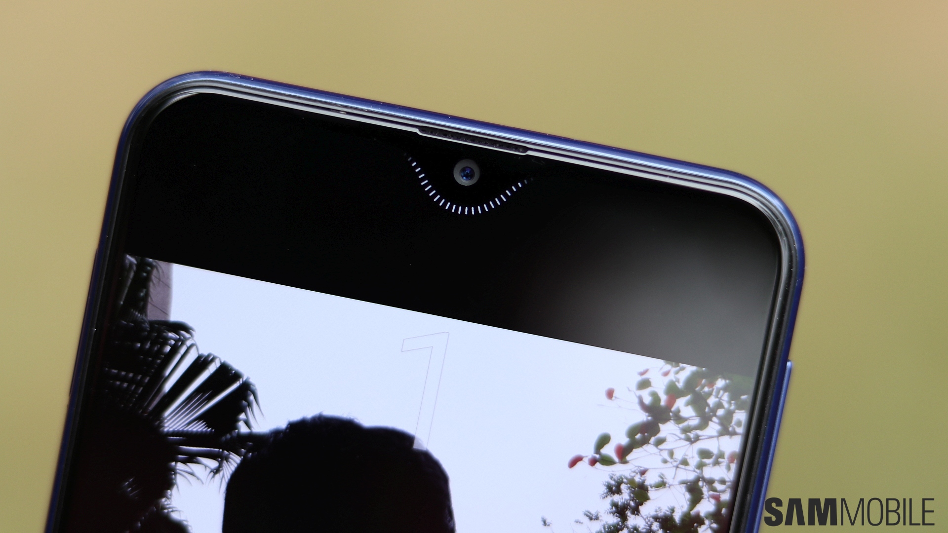
The 8-megapixel selfie camera does well with color accuracy and detail in bright daylight, but move indoors or to not-so-well-lit environments and it tends to smoothen things out a bit too much. The background can also get overexposed at times. You also get Live Focus for bokeh selfies, and it actually works better than Live Focus for the rear camera on most occasions. And Samsung has added a neat little touch for when you use the palm gesture or use the timer for taking selfies: The display around the notch lights up to represent a smiling face and starts blinking a moment or two before the timer is about to run out. The lights also come up when you switch from the rear to the front camera.
Below is a picture of what that smiley thing around the notch looks like. And just after that you can see some selfie samples, including a couple of Live Focus selfies.


Performance: Runs PUBG, but has a few hiccups in regular use
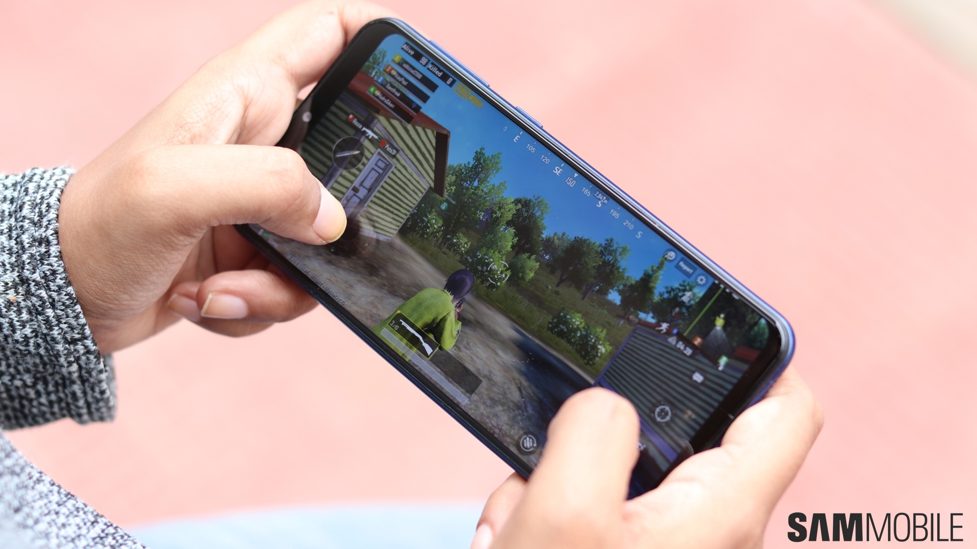
The Galaxy M20 is the most powerful budget phone from Samsung yet. It’s the first to be powered by a processor that has some cores that are focused on performance. Previous budget phones have all had only power-efficient cores underneath, which has proven to be a problem for Samsung’s not-so-optimized software. With the M20, Samsung India told us it wanted PUBG to be playable on the phone, and that’s indeed possible at the default graphics settings. It should be able to run Fortnite as well, but that game isn’t available for the M20 yet.
While performance in general operation was quite good, it still left me a bit disappointed. Samsung told us it has removed some software features that it thinks millennials (young people) don’t use – such as Bixby Home – in order to make the phone run faster, but it didn’t seem to be enough to avoid stutters and lag from time to time. The animations are smooth and apps launch quickly for the most part, but I saw the phone having issues when switching between two apps or failing to instantly respond to my press of the home button.
The screen doesn’t always turn on instantly when I tap the fingerprint sensor, either, and the camera app can take some time to become usable and let you take a photo. That’s in a week of using the phone as my daily driver, which makes me worry about the long-term performance, especially of the variant with 3GB of RAM. Perhaps a Snapdragon 636 would have been a better option instead of the Exynos 7904, as Samsung seems to do a better job with Snapdragon chips in the mid-range and budget segment than with its in-house processors.
The fingerprint sensor on the Galaxy M20 is quite quick and accurate, although it can be hard to reach as I mentioned in the design section. As on the Galaxy S9, the M20’s fingerprint sensor allows you to register your finger with 1-3 swipes instead of requiring you to tap it multiple times. The M20 also comes with facial recognition for unlocking the phone. As usual, it’s just a bonus feature that you can do without, since facial recognition is neither fast nor useful in poor lighting conditions.
Audio and call quality: Dolby Atmos makes a difference
The M20’s single bottom-firing loudspeaker doesn’t get loud enough, but it doesn’t distort at full volume, despite being tuned towards the higher frequencies (treble). There’s little to no bass or thump to the sound, so you’re better off using earphones for the best audio experience. And while the phone doesn’t come bundled with earphones, you can get some amazing sound when Dolby Atmos is enabled.
Dolby Atmos works for wired and Bluetooth audio, and turning it on noticeably enhances the sound output, increasing both volume and stereo separation. The M20 also does well in the connectivity department. Network reception was not an issue except in areas like underground parkings, and I had no trouble with hearing the other person on calls. The phone supports dual VoLTE, so you can have two SIMs running in 4G mode at the same time.
Software: Should have come with Android Pie and One UI
With Android 8.1 Oreo out of the box, the Galaxy M20, like any other budget phone released a month or two before Samsung’s latest Galaxy S flagship, feels outdated. It’s a tradition for Samsung despite the fact that the company could have put the newest version of Android on the device, but it’s especially problematic at this point in time. Samsung’s new One UI skin makes substantial changes to the look and feel of its software, and M20 buyers will find themselves having to adjust to the new UI in just a few months when the Android Pie update arrives later this year.
That said, the Samsung Experience 9.5 skin will keep things familiar for those moving from another Galaxy phone. And on the M20, the company has stripped away Bixby Home, which is great since without the dedicated physical Bixby key, Samsung’s virtual assistant is rather useless. It has also stripped some other functionality to keep things running well, but the company has gone a bit too far with some aspects, like offering the blue light filter feature but not allowing you to customize the filter’s opacity or set a custom schedule.


The M20 also comes with the Lock Screen Stories feature enabled out of the box. This feature puts a new wallpaper from the internet on the lock screen every time you turn the screen on and allows you to read up on the subject of the current wallpaper. It’s irritating because while you get some stunning wildlife and nature wallpapers, you will also see images of Bollywood actors like Shah Rukh Khan from time to time. Some might like it, but others will just want to turn off the feature as soon as they set up the device.
The M20 gets some standard Samsung features, such as Multi Window, one-handed operation, Dual Messenger, themes support, and navigation bar gestures. There’s no Always On Display (AOD), which I feel is a missed opportunity since the M20’s big battery would be very capable of lasting long with AOD enabled. AOD would also act as an alternative to a notification LED, which is missing on the M20. Samsung could add it with a software update, but I wouldn’t bet on that since the company would want to have some features exclusive to its higher-end devices.
Battery Life: Long-lasting, but could have been better
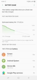
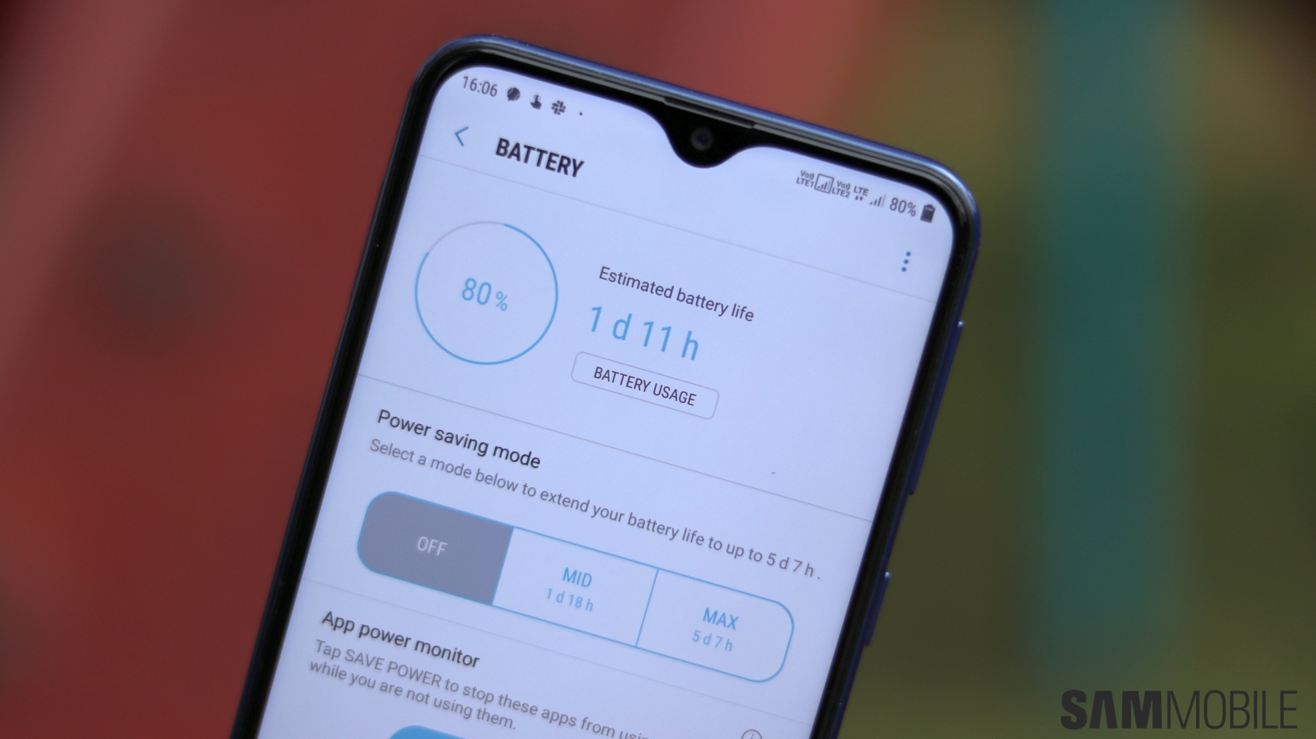
The Galaxy M20’s most attractive feature is no doubt the 5,000 mAh battery, but I have to say it fell a tad short of my expectations. It’s great when you look at it in a vacuum, but considering this is a budget phone with a mid-range SoC and fewer software features than the Galaxy Note 9 with its 4,000 mAh battery, I expected it to have better endurance. I could easily make it into the afternoon the next day without needing to charge the phone, but that’s about it. Basically, it’s one-and-a-half-day battery life, not two-day battery life as you would hope from a phone with a 5,000 mAh battery.
But, overall, battery life is very dependable, and there’s no way to drain it completely in one day unless you play a game all day long or do things like watching too much YouTube on an LTE connection. I never had to turn on the power saving modes, nor was I ever in a situation where I had the risk of the phone dying out on me. It’s also good to see the M20 supports fast charging. It takes around 2.5 hours to reach 100 percent, according to Samsung, which isn’t bad for a 5,000 mAh battery. Along with fast charging, the M20 gets the distinction of being Samsung’s first budget phone with a USB Type-C port as well.


Conclusion: An unexpected masterstroke
You must be wondering how the Galaxy M20 is a masterstroke when almost every aspect of the phone has some terms and conditions that stop it from being truly great in any department. Well, it’s a masterstroke because Samsung has managed to price the phone unexpectedly well. I mean, the Galaxy J6 launched in May last year with a higher price tag for the base model despite having far lesser specs than the M20. I guess Samsung finally realized it has to forego all profits if it wants to stay competitive in the budget smartphone market.
It makes the Galaxy M20 quite easy to recommend, especially since the notch didn’t turn out to be as big of a problem as we had been expecting. Features like the 5,000 mAh battery and the ultra-wide camera make it unique among competition from Chinese manufacturers like Xiaomi, and while all the specs and features don’t make for as good a package as I had hoped, it’s a brilliant start to 2019 for Samsung and makes me excited for the company’s future budget offerings. Samsung calls this a phone for millennials, but anyone looking for an affordable phone for less than ₹15,000 (roughly $210) can pick the Galaxy M20 up.
| Pros | Cons |
| Big screen on a compact body | Notch reduces viewing area in video playback and games unoptimized for notches |
| Fairly high-quality LCD Infinity-V display | Surprising quirks in performance in day-to-day operation
|
| Notch is not too intrusive | Ultra-wide camera has limited resolution |
| Ultra-wide camera on a budget, software-based Live Focus support | Primary camera suffers in low-light conditions |
| Long-lasting battery with fast charging | Battery life could have been better |
| Exynos 7904 chipset can run high-end games, a first for a budget Samsung phone | Buyers will have to readjust to One UI just a few months later when Pie comes out |
| First budget Galaxy with a USB Type-C port and an ambient light sensor | |
| Great pricing |
The post Samsung Galaxy M20 review: Putting the ‘M’ in masterstroke appeared first on SamMobile.
SamMobile http://bit.ly/2G1z802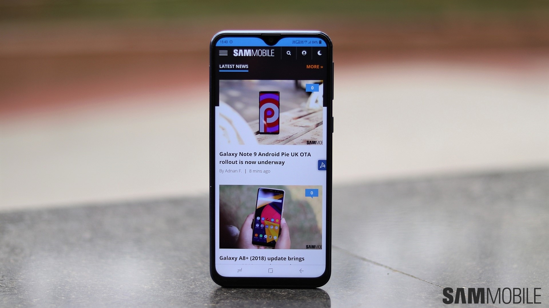


Tidak ada komentar:
Posting Komentar