After a long time, Samsung has switched up the location for the unveiling of its newest Galaxy S flagship. This year, Samsung chose San Francisco, with its biggest rival Apple in the backyard, for the Unpacked event. We flew to San Francisco and got the chance to play around with the newly announced Galaxy S10 lineup. Does it beat our expectations and rise beyond what all the leaks made it out to be? Let’s find out!
Galaxy S10 hands-on: Design
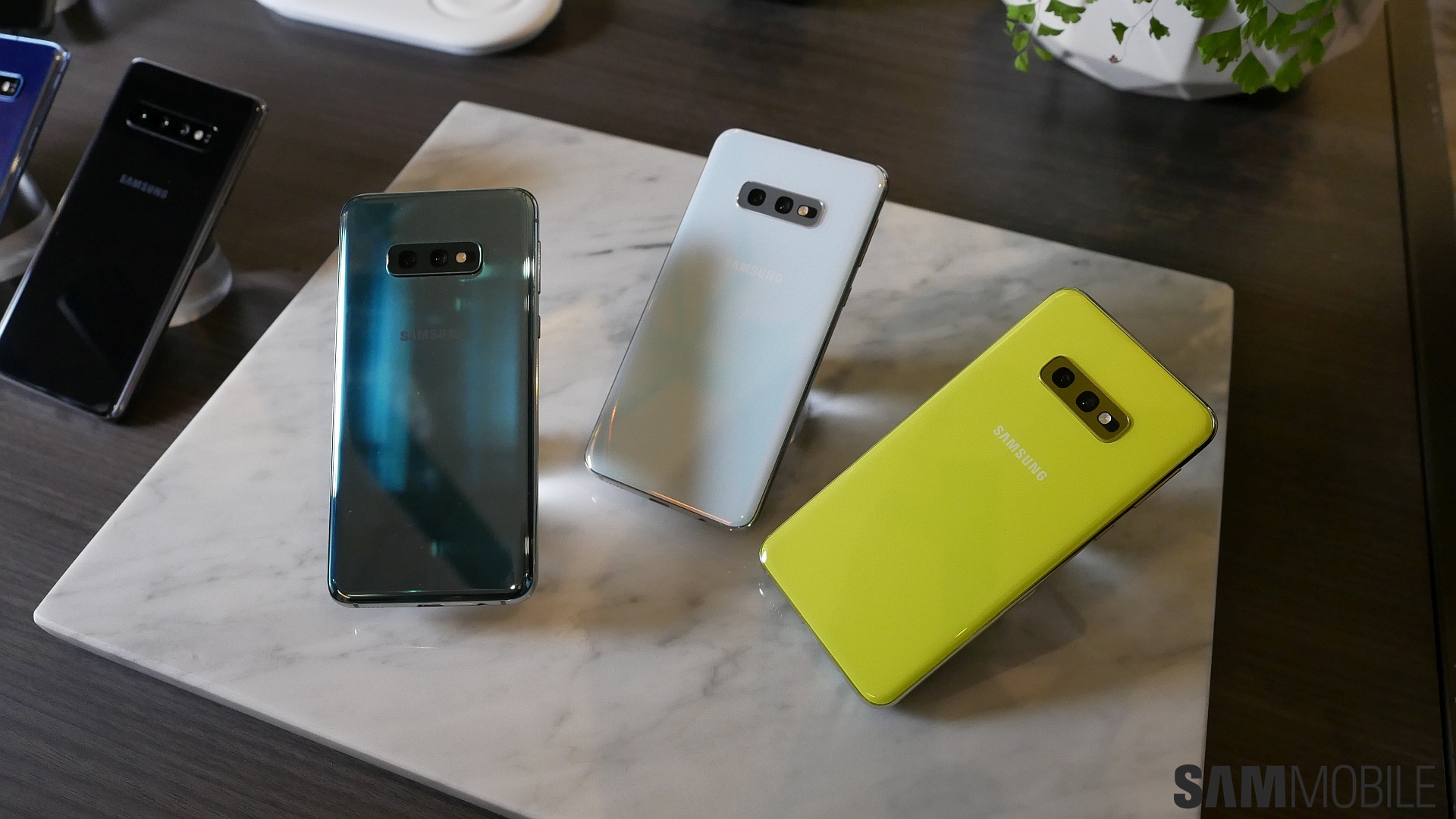
Our initial impressions based on leaked photos was that the Galaxy S10 lineup was just a Galaxy S9 with smaller bezels. Well, we have to say we were too quick to jump to conclusions, as the Galaxy S10e, Galaxy S10, and Galaxy S10+ are more than that. It feels a lot more premium compared to the Galaxy S9, and you can simply feel the metal and glass working their magic. The camera hump on the back looks like it belongs as well.
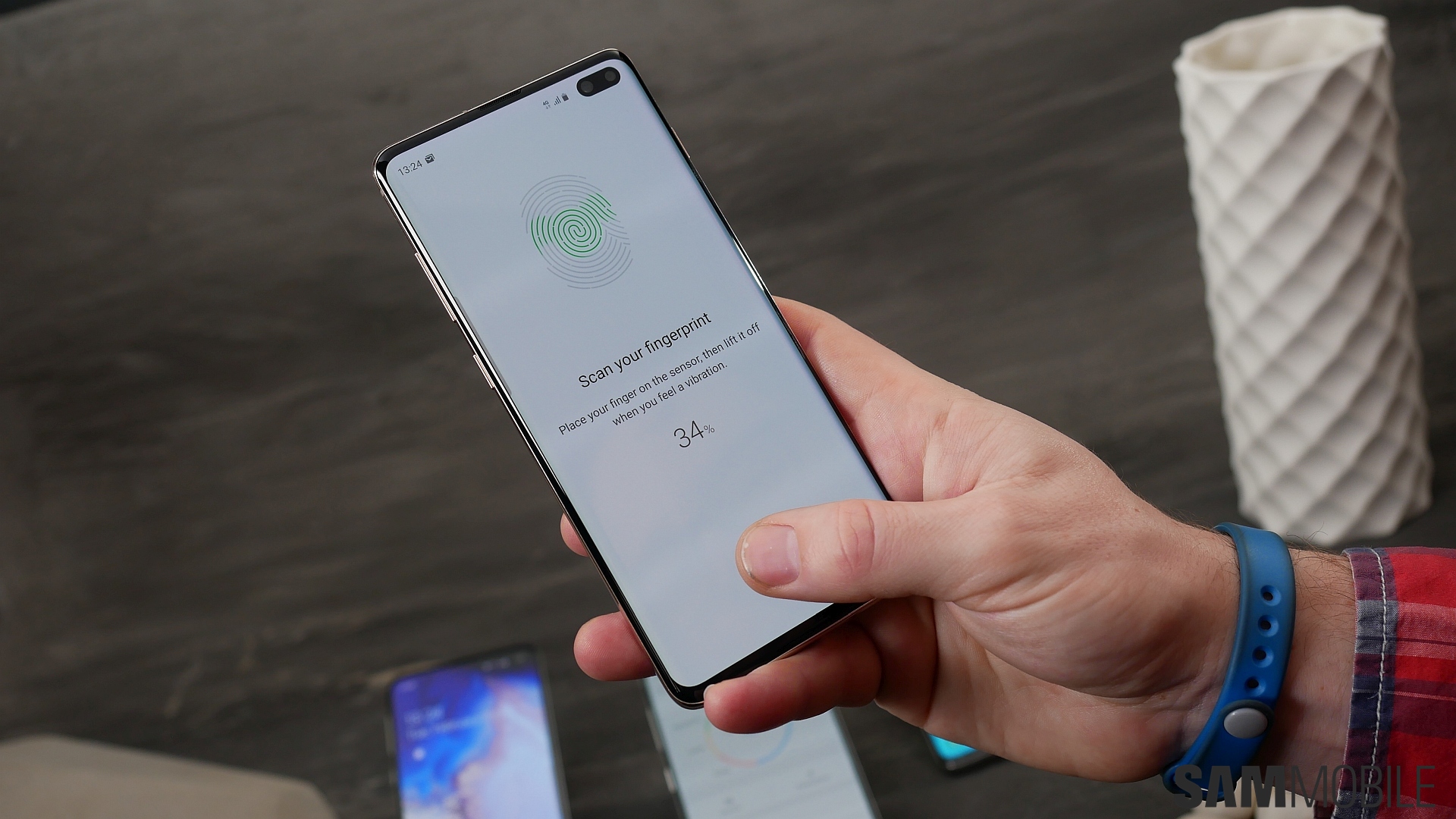
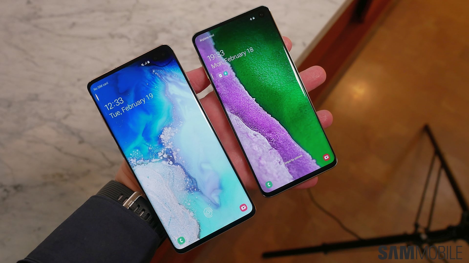
Samsung has also put the fingerprint sensor under the display on the Galaxy S10 and S10+, and it works quite great and feels nice to use, with some fun animations to go along with it. The Galaxy S10e has the fingerprint reader embedded into the power button on the side, similar to the Galaxy A7 (2018). We like the placement of the sensor on the S10e, though. Existing features, such as a 3.5mm headphone jack and the Bixby, volume, and power keys, have been left as is.
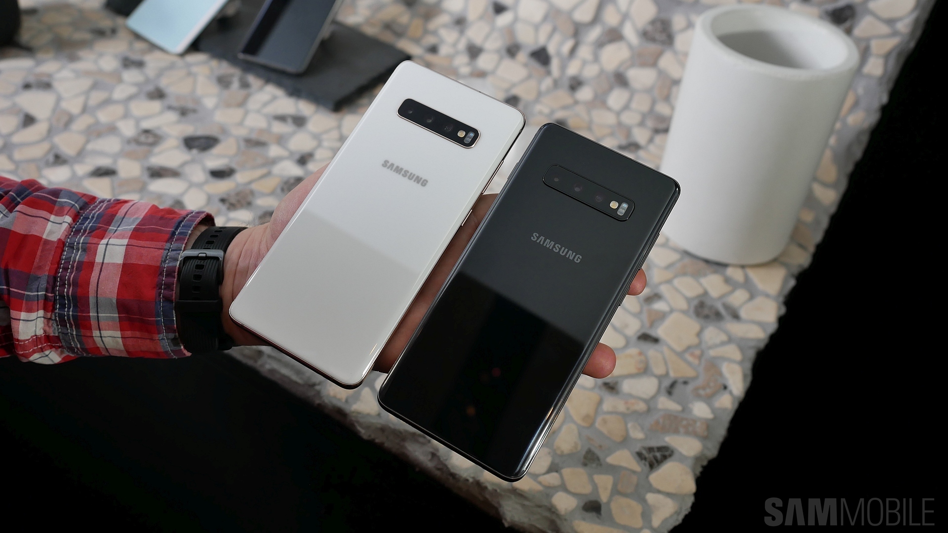
We moved on to the ceramic version of the Galaxy S10+ once we were done with the regular models, and we have to say the ceramic versions feels even better in hand, although that is to be expected. We tried both the white and black ceramic models, and the former simply stole our hearts. In fact, everyone in attendance in the hands-on area seemed to like it, and Samsung didn’t hold back with advertising the white ceramic model, either.


Infinity-O displays
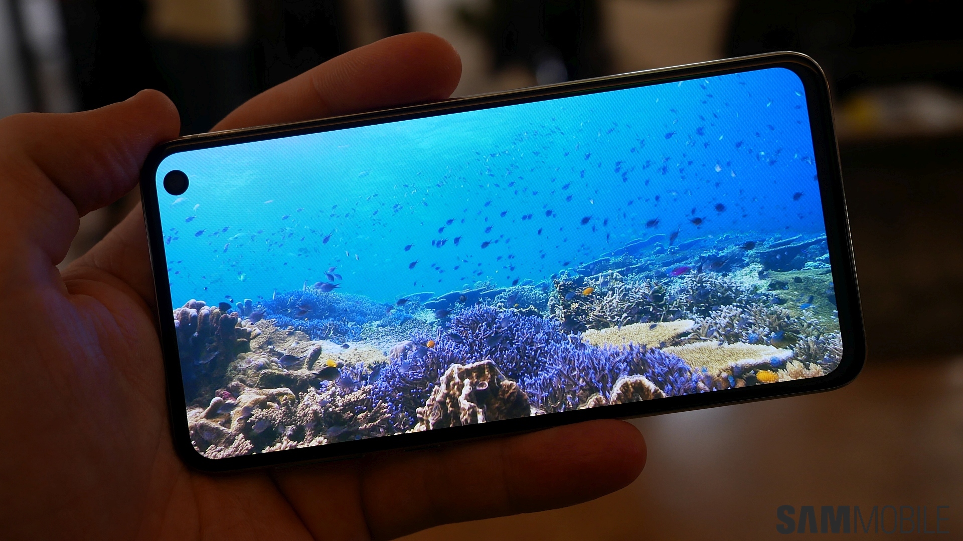
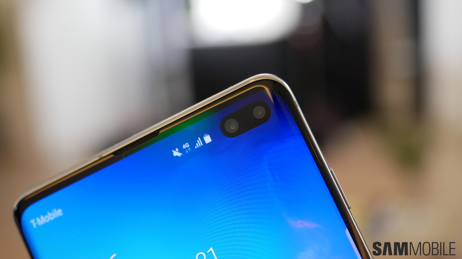
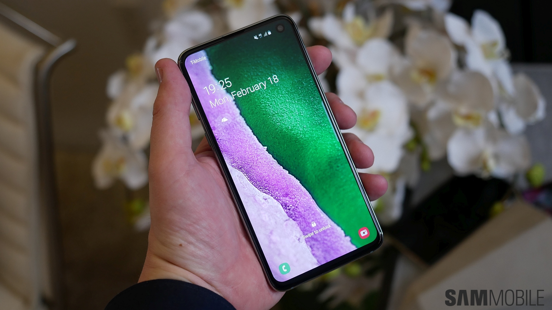
The Galaxy S10’s Infinity-O displays are perhaps the biggest change we see on Samsung’s tenth-anniversary flagship. The Infinity-O display was unveiled at Samsung’s developer conference last year and was seen on the Galaxy A8s in China, and it’s the branding for every screen that has a hole in it for the front camera. It’s designed to make you feel like the device has no notch, but with a slight twist.
Samsung is proud of what it has achieved with the Galaxy S10 displays and considers them the best it has made yet. The display has HDR10+ support, can go up to 1200 nits of peak brightness, and comes with TUV Rheinland certification, which means it can reduce blue light by 42 percent without sacrificing image quality. Of course, what matters to you and us is how the Galaxy S10 display performs in real life. Is that camera hole really better than a notch? Well, that’s an opinion that will vary from person to person, but we have to say it does seem like a better solution to a notch.


We liked the Galaxy S10 and S10e in particular; it will take some time for us to warm up to the Galaxy S10+’ dual cutout. Also, all three Galaxy S10s miss out on a notification LED because of lack of space on the display. You don’t get to hard press the area around the home button to wake up the screen on the S10 and S10+, either, as the haptic feedback and pressure points have been moved up for the in-display fingerprint sensor.
Overall, we believe Samsung’s new displays look beautiful, and as with previous flagships, Samsung will offer you the option to tune the display to your liking from the display settings.
Interface
Back in November last year, Samsung introduced One UI, its vision for the future of smartphone user interfaces. One UI’s main goal is to make phones easier to use with one hand, and we have already seen the new interface on the Galaxy S9 and Galaxy Note 9 with the Pie update. If you want to know more about One UI and its features, you can check out this link. As far as the Galaxy S10 is concerned, Samsung hasn’t changed too much for the new flagships. Some settings look different, but overall, it all looks the same, which is good since it brings consistency across all devices.
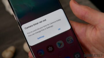
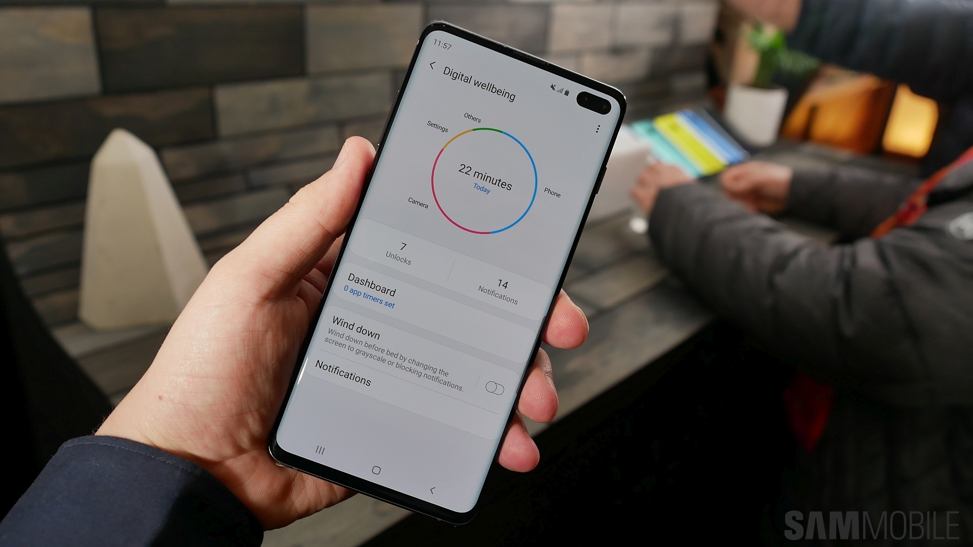
One thing Samsung did change – or upgrade, to put more precisely – is the One UI version. The Galaxy S10 trio run One UI 1.1, and the major addition on the newer version is Samsung’s own version of Android’s Digital Wellbeing feature. Wellbeing is basically designed to enable you to reduce your smartphone addiction. It tells you how long you open some apps and lets you put a timer to remind you to stop using a particular app. It can also turn the screen to grayscale after a while to demotivate you from using the phone. Of course, it’s up to you if you want Digital Wellbeing to help you out, as it’s an optional feature.



So what else is new on the software front? Well, you can set the phone to change its wallpaper every time you unlock the device. There’s a new gaming option for Dolby Atmos, although we have seen that on the Galaxy Note 9 as well. It will also come to other devices with Dolby Atmos, such as the Galaxy S9. And as an extension of the Adaptive Battery feature, the Galaxy S10 will attempt to keep your favorite apps in memory ahead of time for faster opening times.
Camera
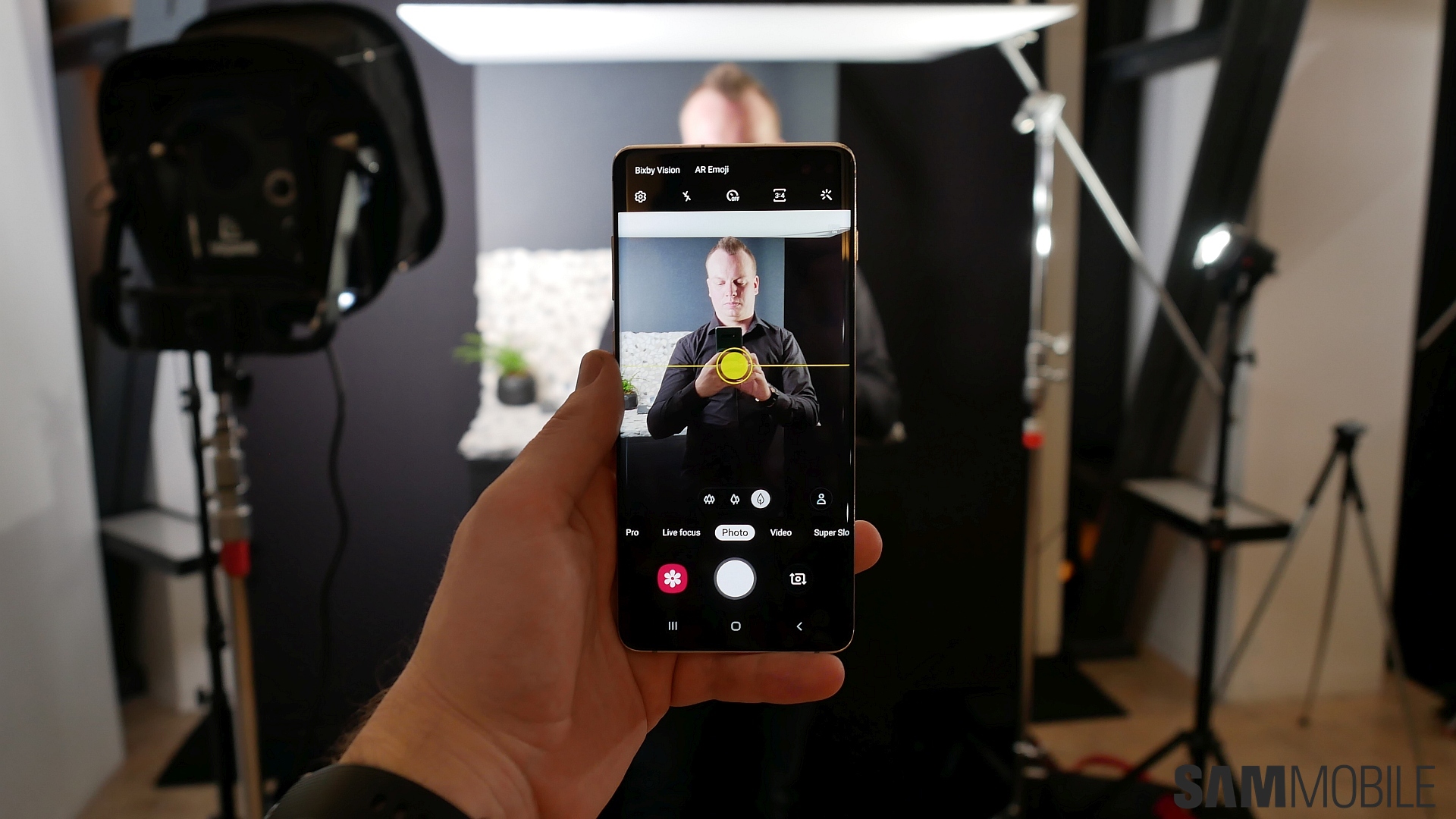
With the Galaxy S10 lineup, Samsung wanted to have powerful cameras. The front camera on all three models is now a 10MP sensor with Dual Pixel autofocus and the ability to record 4K videos. The S10+ gets a second camera at the front. It’s an 8MP RGB depth sensor for nicer portrait pictures. On the back, you will see two cameras on the Galaxy S10e. The first is the same 12MP Dual Aperture sensor from the Galaxy S9 while the second is an ultra-wide camera with a 123-degree field of view and 16-megapixel resolution. The Galaxy S10 and S10e have three rear cameras: The two from the S10e and a telephoto 12MP lens like the Galaxy Note 8, Galaxy S9, and Galaxy Note 9.


We couldn’t test the camera much, but Samsung it has added some new features. There are ten new scenes for the Scene Optimizer feature, and the Galaxy S10 will tell you how to create the best picture depending on the subject you’re trying to capture as part of its AI-enhanced capabilities. In the advanced menu, you can find the option to record HDR10+ video, a first for any smartphone. However, 8K video recording isn’t available, most likely because the Snapdragon 855 doesn’t support it. That could be disappointing for those who bought/will buy a brand new 8K TV from Samsung, but it probably won’t matter to anyone else.
Battery
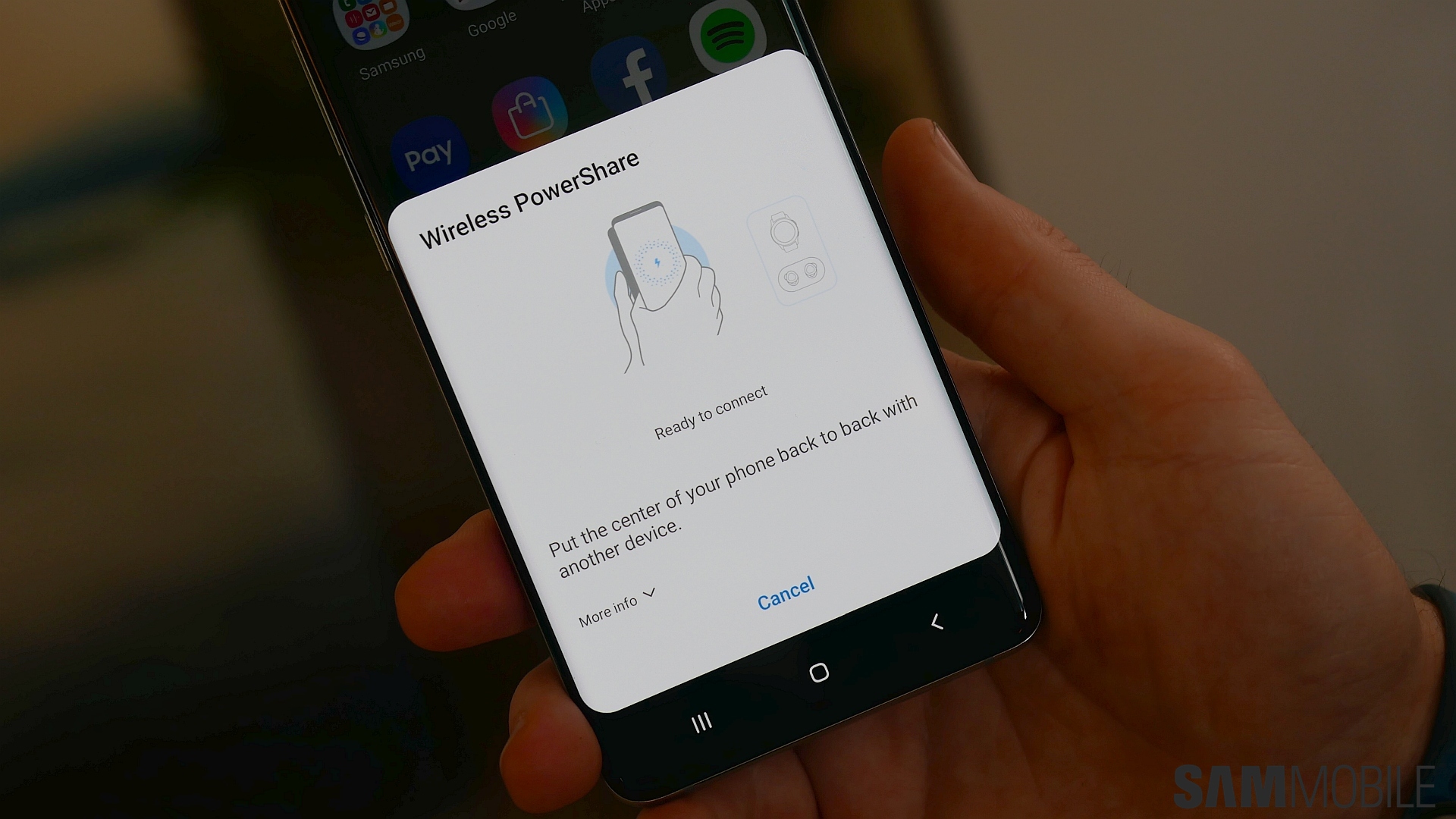
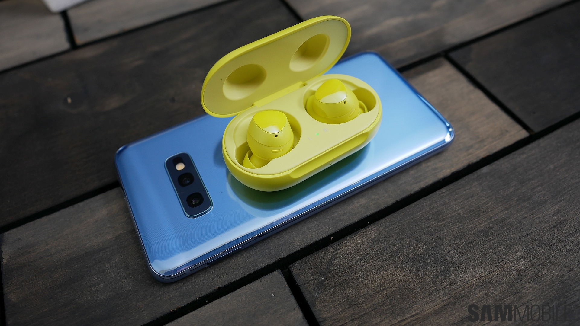
The Galaxy S10e, Galaxy S10, and Galaxy S10+ are powered by 3,100 mAh, 3,400 mAh, and 4,100 mAh batteries. Naturally, we couldn’t test battery life, but we did get to test Samsung’s new Wireless PowerShare feature. PowerShare is reverse wireless charging, which means you can use your Galaxy S10 to charge other devices that support wireless charging. It’s going to be especially useful for charging your wearables, like the new Galaxy Watch Active or Galaxy Buds earbuds.
Reverse wireless charging is not a new feature. Huawei has already done it on one of its phones, but it’s nice to see Samsung learning from the competition instead of denying new ideas coming from other manufacturers. Wireless PowerShare works quite well, but how helpful it will be will depend on the user. One thing is for sure: You’d be better off not telling friends addicted to Pokemon Go or PUBG about it if they have a phone with wireless charging support, or you might be relegated to offering them a charge when they need it.
Samsung has also improved fast wireless charging speeds for the Galaxy S10 itself. However, we have to say we’re disappointed that Samsung hasn’t increased the wired charging speeds on the Galaxy S10 lineup. The wired fast charge speeds are still stuck at 15 watts, while the competition has moved on to considerably faster solutions. The Galaxy S10 5G will come with 25W charging, but it would have been nice to see it on the regular S10s as well.
Conclusion
So here’s a revelation on our part that may surprise you: The Galaxy S10e was our favorite of the three models, at least until we had played with the ceramic version of the Galaxy S10+. We are quite happy to see a smaller flagship phone with a flat display. The look and feel of the S10e was unexpectedly nice, and we can see a lot of consumers being attracted by the Galaxy S10e.
And the entire Galaxy S10 lineup looks great overall. That Infinity-O display makes the phones feel really premium by making it seem like there’s an endless screen on them, and the ceramic Galaxy S10+ is just stunning to behold. We can see why Samsung is so proud of the Galaxy S10 series, and we can’t wait to get one of these beauties for ourselves. The Galaxy S10 is a great follow up to the Galaxy S8 and Galaxy S9 and our first impressions are overwhelmingly positive.
Look forward to our full review of the Galaxy S10 lineup in March or early April!
The post Samsung Galaxy S10 hands-on: Tenth-anniversary flagship done right? appeared first on SamMobile.
SamMobile https://ift.tt/2GZ1OpY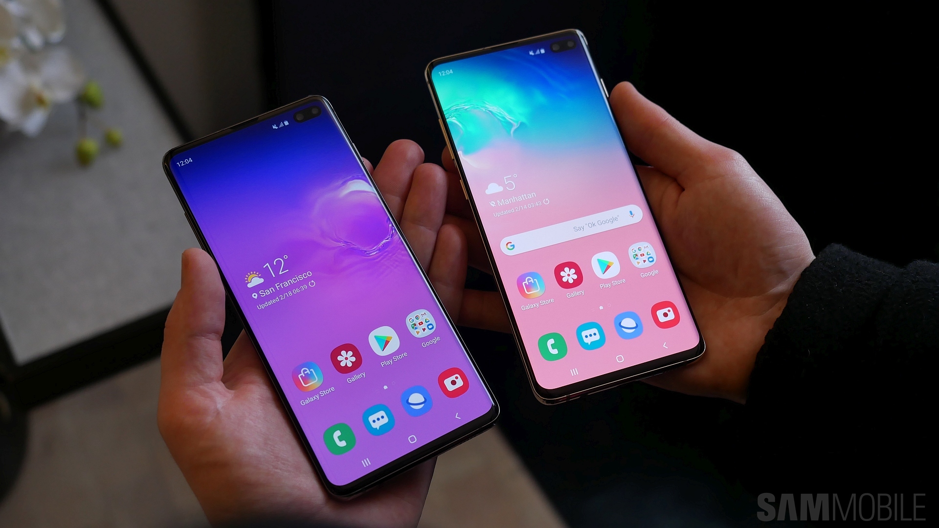



Tidak ada komentar:
Posting Komentar