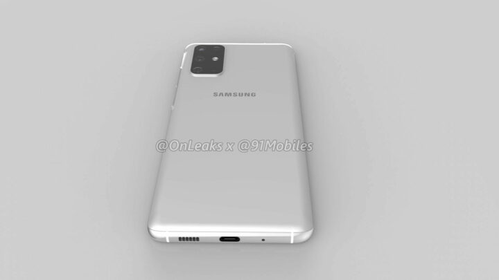
The most important Galaxy S11 leak has finally arrived today. Renders of Samsung’s next flagship have been published by Twitter leakster @OnLeaks, giving us an early look at what the device could look like.
The Galaxy S11 is still a few months away from an official launch so things could change down the line, but we can expect the phone’s design to be more or less similar to what has been shown in these renders. Such renders always appear months before the official launch and tend to be a somewhat accurate depiction.
Leaked Galaxy S11 renders show key design changes
Samsung is going to release three different models of its next Galaxy S flagship, just like it did this year. The Galaxy S11e, Galaxy S11 and the Galaxy S11+ will all have a similar design. The cheapest variant will be more like its siblings this time around as Samsung is expected to opt for curved panels across the entire lineup.
The silhouette appears to be quintessentially that of a Galaxy S flagship. However, there are a couple of design changes that jump out. The rear camera setup loses its horizontal positioning in the center to a left-aligned vertical position. That’s a departure from what has been the norm on this series for the past few years. The camera setup also appears to adopt the new L-shape that has previously been discussed for the unannounced Galaxy A51 and Galaxy A71. It appears that there may be a total of five sensors at the back in addition to an LED flash.
The Galaxy S11 seemingly takes a page out of the Galaxy Note 10’s book and places the punch hole for the camera in the center of the display. It does look better than the current setup on the Galaxy S10, that’s something a lot of people agreed on when Samsung opted for a center-aligned hole on the Galaxy Note 10. Many will be glad to see that it’s making the same decision for the Galaxy S11.


The placement of the physical buttons is likely going to change as well. The renders show the power and volume buttons on the right side of the frame. The Galaxy S10 had its volume + Bixby keys on the left and power key on the right. It’s only with the Galaxy Note 10 that Samsung decided to ditch the Bixby button and put all of them on one side (left) of the phone. Samsung’s doing that for the Galaxy S11 as well but on the opposite side. It has released some mid-range phones that have all buttons on the right.
These renders are for the Galaxy S11 and the handset is said to measure 161.9 x 73.7 x 7.8mm. The thickness goes up to 8.9mm when taking the camera bump into account. Earlier reports suggest that it’s going to have a 6.7-inch display. The Galaxy S11e, Galaxy S11 and Galaxy S11+ are said to feature a 6.3-inch, 6.7-inch and 6.9-inch display respectively. There’s a reason to believe that it may have a 120Hz refresh rate panel which would be a first for any Samsung phone.
You’ll find an Exynos 990 chip under the hood or the Snapdragon 865 in select markets. There’s a lot of excitement about the camera as well. The Galaxy S11 could be Samsung’s first phone with a 108-megapixel primary camera. The entire setup may also include a 5x zoom telephoto lens with OIS, an ultra wide-angle lens and a ToF sensor. It’s obviously going to be running Android 10 with One UI 2.0 on board.
Samsung isn’t due to unveil the Galaxy S11 series until next year so we’ll be hearing a lot more about it before then. Keep in mind that things could change in the meantime, even though this source has a good track record with such renders. Which of the main design changes do you like or dislike? Share your thoughts in the comments below.
The post Galaxy S11 renders leaked, come take a look! appeared first on SamMobile.
SamMobile https://ift.tt/2sa0BXN


Tidak ada komentar:
Posting Komentar